Bootstrap Login forms Layout
Intro
Sometimes we really need to take care of our precious web content to grant access to only several people to it or dynamically personalize a part of our sites according to the certain customer that has been actually viewing it. But just how could we potentially know each particular website visitor's persona considering that there are certainly so many of them-- we must get an easy and efficient solution learning about who is whom.
This is where the visitor access control comes along primary interacting with the site visitor with the so knowledgeable login form element. Within the most recent fourth version of the most well-known mobile friendly web site page design framework-- the Bootstrap 4 we have a lots of elements for developing this type of forms and so what we are actually planning to do here is having a look at a particular instance how can a simple login form be developed employing the helpful tools the most recent version goes along with. ( additional resources)
Effective ways to utilize the Bootstrap Login forms Dropdown:
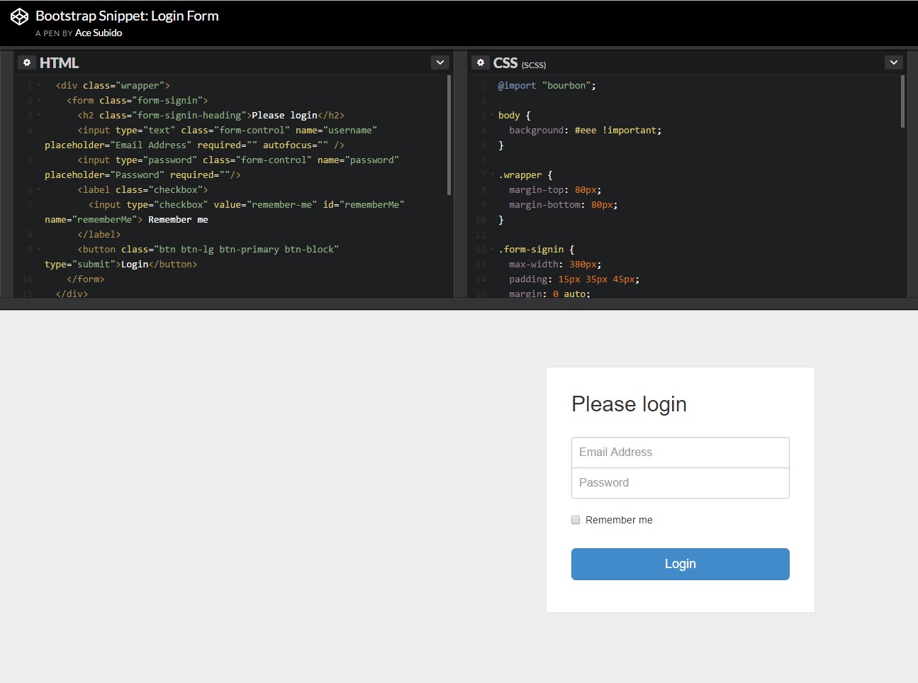
For beginners we require a
<form>Inside of it several
.form-groupTypically it's more practical to employ site visitor's mail as an alternative to making them figure out a username to authorize to you due to the fact that typically any individual understands his mail and you can easily constantly ask your users another time to exclusively give you the way they would like you to address them. So within the first
.form-group<label>.col-form-labelfor = " ~ the email input which comes next ID here ~ "Next we require an
<input>type = "email"type="text"id=" ~ some short ID here ~ ".form-controltypeNext comes the
.form-group<label>.col-form-labelfor= " ~ the password input ID here ~ "<input>After that comes the
.form-group<label>.col-form-labelfor= " ~ the password input ID here ~ "<input>Next we should set an
<input>.form-controltype="password"id= " ~ should be the same as the one in the for attribute of the label above ~ "Finally we require a
<button>type="submit"Representation of login form
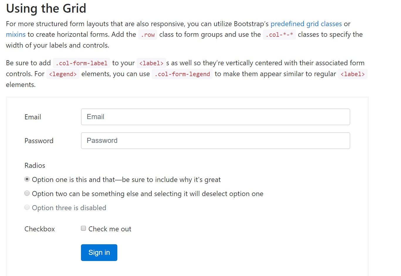
For even more organized form layouts that are also responsive, you can easily make use of Bootstrap's predefined grid classes or mixins to develop horizontal forms. Add in the
. row.col-*-*Ensure to incorporate
.col-form-label<label><legend>.col-form-legend<label>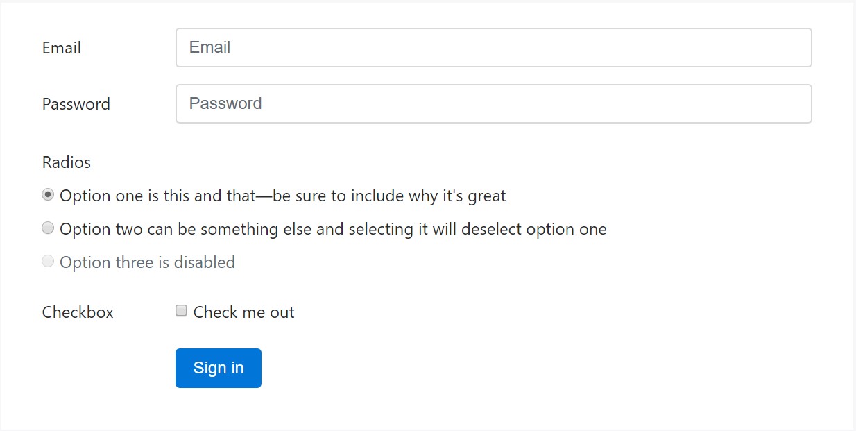
<div class="container">
  <form>
    <div class="form-group row">
      <label for="inputEmail3" class="col-sm-2 col-form-label">Email</label>
      <div class="col-sm-10">
        <input type="email" class="form-control" id="inputEmail3" placeholder="Email">
      </div>
    </div>
    <div class="form-group row">
      <label for="inputPassword3" class="col-sm-2 col-form-label">Password</label>
      <div class="col-sm-10">
        <input type="password" class="form-control" id="inputPassword3" placeholder="Password">
      </div>
    </div>
    <fieldset class="form-group row">
      <legend class="col-form-legend col-sm-2">Radios</legend>
      <div class="col-sm-10">
        <div class="form-check">
          <label class="form-check-label">
            <input class="form-check-input" type="radio" name="gridRadios" id="gridRadios1" value="option1" checked>
            Option one is this and that—be sure to include why it's great
          </label>
        </div>
        <div class="form-check">
          <label class="form-check-label">
            <input class="form-check-input" type="radio" name="gridRadios" id="gridRadios2" value="option2">
            Option two can be something else and selecting it will deselect option one
          </label>
        </div>
        <div class="form-check disabled">
          <label class="form-check-label">
            <input class="form-check-input" type="radio" name="gridRadios" id="gridRadios3" value="option3" disabled>
            Option three is disabled
          </label>
        </div>
      </div>
    </fieldset>
    <div class="form-group row">
      <label class="col-sm-2">Checkbox</label>
      <div class="col-sm-10">
        <div class="form-check">
          <label class="form-check-label">
            <input class="form-check-input" type="checkbox"> Check me out
          </label>
        </div>
      </div>
    </div>
    <div class="form-group row">
      <div class="offset-sm-2 col-sm-10">
        <button type="submit" class="btn btn-primary">Sign in</button>
      </div>
    </div>
  </form>
</div>
Final thoughts
Primarily these are the primary features you'll need to create a standard Bootstrap Login forms Modal with the Bootstrap 4 system. If you seek some extra challenging presences you're free to get a full benefit of the framework's grid system setting up the components practically any way you would certainly believe they must take place.
Check out some on-line video short training about Bootstrap Login forms Css:
Related topics:
Bootstrap Login Form formal information
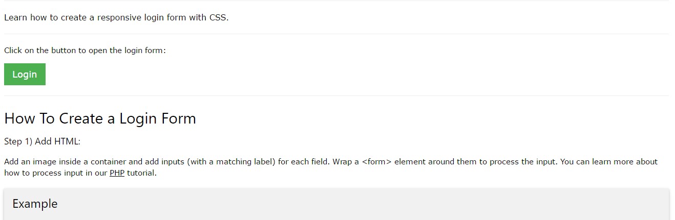
Short training:How To Create a Bootstrap Login Form
Other example of Bootstrap Login Form